
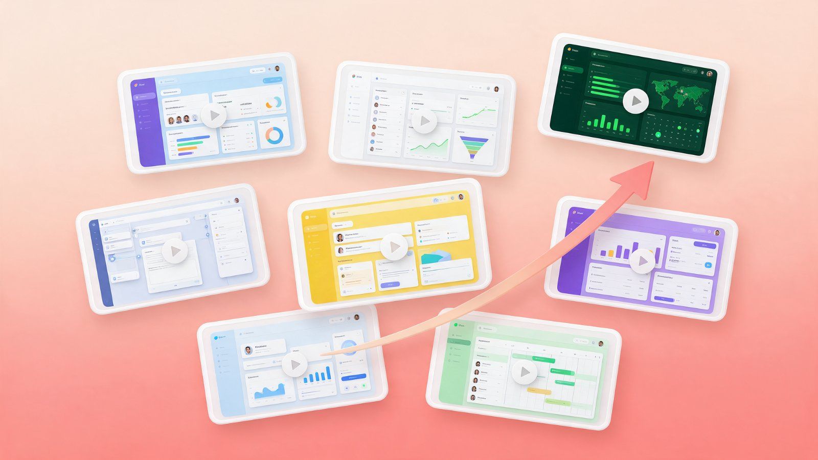
When you look at SaaS explainer videos that actually drive sign-ups, the same patterns show up again and again. They are not about fancy effects. They are about clarity. Here are seven patterns to use in your own explainer video.
1. They start with the problem
Good explainers open with a pain your viewer recognises in the first seconds, before the logo or product name appears.
2. They show the real product
Clean UI animation of the actual interface builds more trust than abstract shapes. Simplify the screens, highlight the important parts and guide the eye with motion.
3. One idea per scene
Each scene explains one benefit. A visual storyboard is the easiest way to check this before animation starts.
4. Benefits over features
"Find any file in seconds" lands better than "advanced indexing engine". Features belong in the demo; benefits belong in the explainer.
5. A clear, consistent visual style
Brand colours, consistent icons and smooth motion graphics make the product feel polished and reliable.
6. One call to action
Start a free trial, book a demo or visit a page. One clear next step at the end, shown on screen.
7. Short cut-downs for ads
The best teams reuse their explainer as 15 to 30 second video ads for LinkedIn, YouTube and Meta, often in vertical 9:16 versions.
Example: a Microsoft 365 Copilot explainer for Kloudify
In a SaaS explainer created for Kloudify Technologies, the video shows how Microsoft 365 Copilot supports work across Word, Excel and Outlook, highlights secure data access anytime and anywhere, and ends with a clear Kloudify call to action. Each benefit gets its own scene with simple UI animation and motion graphics.
See more in the SaaS explainer video portfolio.
About the author: Mahadi Hasan is a Visual Storyboard, Motion Designer & Video Editor based in Dhaka, Bangladesh. He creates performance video ads, SaaS explainer videos and talking head edits, in long or short form. See his SaaS explainer video portfolio or get in touch.